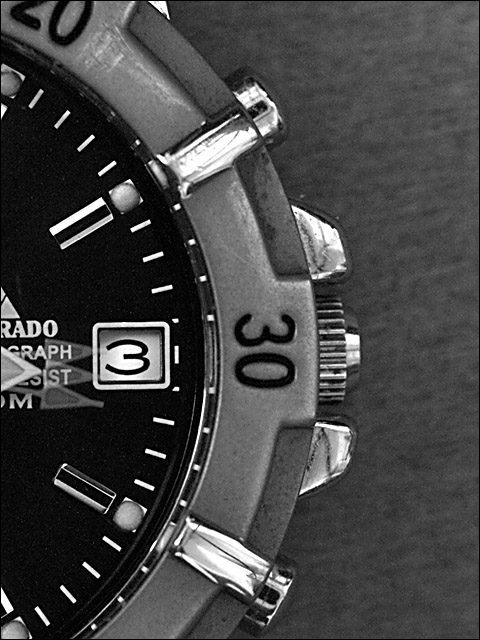
OK lets first review some of the comments given during the challenge marking. Most commentators have mentioned the 3 second exposure and the sweep of the second hand. I agree, I really liked this when I saw it, and marked it highly for just that reason. However, it is true also that this element is not obvious enough, and probably lost a few votes because of this.
Lets move onto the watch itself now. Because you are in close with a macro lens, you need to make sure the object is very clean, any dirt or inperfection shows up here. I think a good clean might have helped, just take a look at the outer bezel, just above the 30, Its not clean and contributes to the overall reduction in sharpness. On the chrome pieces I think I can see reflections of the room too, this can be avoided by using a light tent (see the link here for details of how to construct a very cheap light tent Light tent article). Of course it might be that the reflections are not the room, in which case I stand corrected.
Moving out the background has some grain, which people have commented on below. A good clean background together with the light tent would help massively here.
Finally the crop/composition. As remarked below the image relies on symmetry, and the crop has just managed to miss this. Its almost but not quite there, which is a shame.
Having said all that, I would like to say I am amazed that it ended up in 77th place, it deserved a much higher position than that, simply for the second hand sweep.
I hope some of the points I raised here will help when you come to some future challenge. If so then its been worthwile taking the time to have a deeper look into your entry.
I knew I liked this shot when I first voted. Now that I'm revisiting it to comment, I noticed (for the first time--duh) the 3 second hands. I like it more now, and I'm upping my vote. Only complaint would be - starting the exposure 1 second earlier would have centered the second hand on the 3 mark.
Took me a while to figure out the moving hand. It's not obvious enough, it looks like a watch picture. Not a bad watch picture, but still just a watch picture. I do like the slight graininess. 7
Very good take on the challenge with very sharp contrast effects. It could have been cropped a bit more evenly. Compare the space between the buttons at 2 and 4 and the distance to the frame. There is much more space above 2 o'clock than at 4. Also, the background shows lots of compression and noise probably due to the long exposure.
I think if your lighting was better, you'd have less noise in this shot.
good composition - the curve of the watch makes it interesting, yet the 3 always attracts my attention. cool about the little movement in the second hand.
Very clever. I hope it's not too subtle for people to notice at quick glance. A 1Hz strobe flash, I assume? Must have been frustrating to wait a whole minute between tries.






 Add photograph to your favorites
 Add photographer to your favorites

 Photographer found comment helpful.


