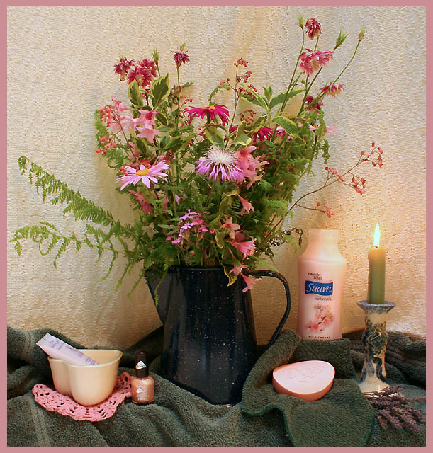
I think the arrangement would have worked better if the bath stuff was more central (therefore more prominent) because when I first looked at the image, I thought the Suave was very out of place until I read the title. I think the titale would fit better if the bath items were more of a focal point than the flowers.
Nicely done. Turn the Suave bottle around so we can't see the words. (If there are words on the other side, too, try wiping them off with some nail polish remover.) The piece of fruit (or whatever that is) has lots details. Try shading it somehow.





 Add photograph to your favorites
 Add photographer to your favorites


 Photographer found comment helpful.


