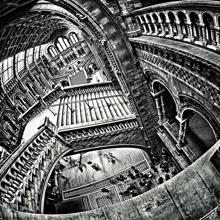
Thanks for the voting. Trying to be objective about it, i thought i had a better angle than Marac's blue ribbon version:
But then it wasnt "original" in a fair few people's minds i imagine.
I tried to bring the HDR towards a sketch look without "ruining" it... but maybe those two points made people vote a bit more conservatively. Still - 2nd place black and white isnt bad eh? ;)
Thanks Marac for the idea!
(and yes the MC Escher reference was intentional - look up "Relativity" and "escher" and you will find *that* sketch...)
Rich
Statistics
Place: 13 out of 434 Avg (all users): 6.6439 Avg (commenters): 8.4706 Avg (participants): 6.6082 Avg (non-participants): 6.7429 Views since voting: 2509 Views during voting: 313 Votes: 132 Comments: 30 Favorites: 15 (view)
6.6 is an insult .. this is just astronomical .. i love escher and this is a superb photographic representation .. i love the sketch look .. this is way more than .. WOW .. !!
congrats on something obviously too artistic and brilliant for dpc .. oops .. dont tell anyone i said that .. !! .:)
The angle here is even better than in "Labyrinth" [thumb]//www.dpchallenge.com/image.php?IMAGE_ID=777758[/thumb]. The processing is great. Escher would have been proud. (not voting)
For a real scene this comes pretty damn close to the original especially the distortion and the graphic look. However, the multiple gravity aspect could have been better illustrated had there been people at those other levels. Nevertheless well done.
Love it! so Escher!thumbnail caught my eye and I had to watch it full size to understand it... Really cool, I really like the effect and the black and white :) Good luck!






 Add photograph to your favorites
 Add photographer to your favorites


 Photographer found comment helpful.


