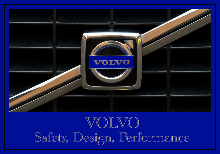
There were some great car shots in the last Automobile Ad challenge. I admire them. They are, however, outside my of my realm of photography. I don't own a car and haven't really driven a car in almost 30 years. I walk or take public transportation and BEV...my good friend who loves to drive. So I shot a couple of logos on a couple of cars and I decided on this one.
Just hope to do better than I did in the last Automobile Ad challenge: 5.0596, 46/58 21% and 20 Comments.
Post:
Camera Raw adjustments in PSElements 6.0.
Rotate CW.
Power Retouche Lens Correction.
Transform Distort, twice.
Crop.
Layer adjustments for levels, brightness/contrast and hue/saturation.
Adjust Sharpness.
Spot edit dust and diret on grill and logo.
Two more crops.
Add frame and text.
Resize.
USM.
Statistics
Place: 32 out of 68 Avg (all users): 5.5263 Avg (commenters): 7.2857 Avg (participants): 5.0625 Avg (non-participants): 5.6331 Views since voting: 996 Views during voting: 371 Votes: 171 Comments: 8 Favorites: 0
A nice, simple image. Clean and well executed, well cropped as well.
The overall presentation of the add is boxy, but then again, so is a volvo. I probably would have not had Volvo in text in the bottom, as the image is clearly volvo, and just had the three words. I feel this would have helped remove the large, obvious blue and resulted in a better overall presentation
clean and simple composition - the choice of blue shade works nicely - i am just convinced about the choice of font - the outlined text looks less professional than the nice block lettering in the actual Volvo symbol






 Add photograph to your favorites
 Add photographer to your favorites


 Photographer found comment helpful.


