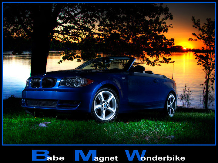
Drawing with light is strobist style. Camera on tripod triggered wireless with cheapo ebay wireless trigger. Holding 1 flash in my hand and aiming it on a different part of the car in each frame, camera triggered wireless, flash triggered wireless ¡¥¡¦ flash wireless aint no chepo ¡¥¡¦ 7 times for 7 frames, 7 different laminated part of the car.
Process: 7 raw frames turned to HDR using Photomatix. Opened the final result in Photoshop, overlaid the 7 frames and masked the layers. Curves, warming filter to the entire image, dodge and burn, neatimage, sharpen, frame and text, more sharpening, SFW
Thanks to my friend Mohamed Saliqa for driving for over 45 min to my place to have the car¡¦s picture taken, I am sure he will be happy with the result. Needless to say, this car is babes magnet .. drove it after the shooting to my place. Thanks Mo for the shooting and the ride :)
Update after the result: I got the message that I screwed up the text few minutes after it went online. I was totally pissed, but was to late to adjust the bike word.
Thanks for all the kind comments .. Appreciated.
Statistics
Place: 14 out of 68 Avg (all users): 6.3614 Avg (commenters): 6.6667 Avg (participants): 6.0667 Avg (non-participants): 6.4265 Views since voting: 2055 Views during voting: 426 Votes: 166 Comments: 19 Favorites: 1 (view)
Initial Impression: very good conceptual shot but falls short in some areas, most already pointed out by commenters. And you are dicing with death by inventing an acronym to go with the BMW. I worked as a copywriter in advertising, and you unless the client is launching a brand extentsion, you NEVER, ever, ever mess with their brand name! Everyone knows BMW is a primo product. No need to invent an acronym to support it.
Technical: the lighting is quite good, composition is acceptable car ad 3/4 front shot. You did a lot of pp, which means your pp is way better than mine - but remember you must have a good shot to work with in the first place! This is a good shot, but could be better.
Artistic: Shot cluttered by the trees. Eliminate the trees and white thingys and shot would be much stronger. Hood of car too dark, maybe try a strobe on the left. I have to agree that too much light on hubcaps. Show more car, less hubcap.
Overall: A very good effort but needs work (see above)
If you have any questions feel free to PM me,
Susan
Remember what I've always said: if at least 50% of your commenters say the same basic thing about your shot, they're probably right!
A great idea, however the lighting on the car is not even enough. Too much of the car is too dark, while the wheels are well lit and bright. The setting of the photo is really good, and with a well lit car, this would have been very good.
The main subject and the background are interesting enough to achieve a good ad image. I would give this a 5 though, because (IMO) a few technical and concept issues have ruined that object:
1.- The worst mistake is conceptual: the use of a kind of "motivational poster" design with fonts, color and a slogan that this famous brand (or any other brand)would never use.
2.- On the processing: you could have (and should have) used the advanced editing rules to solve these issues:
a)compensate the (under) exposure of most of the car...and maybe get some very subtle detail on that tree. Dim a little the excess of light on the grass.
b) clone out those two distracting whitish things on the grass: one in front of the car, the other one below the rear wheel, close to the lower edege of the image.
3.- On the shooting: you could have solved part of the issues mentioned above by moving the car 2 or 3 feet closer to the camera position.
You've let down what could be a potentially good ad here.
I think you're exposure, which admittedly must have been tricky, has left the car a touch dark. Also, the car itself feels out of focus, I'm not entirely sure if that's the case, but the back part definitely feels like it's not as sharp as it could be.
Now the biggey, the text ruins this add. What is otherwise a nice ad with some good scenery is completely ruined by the text. If I saw that by the side of the street I definitely wouldn't want one of those!
Giving this a 5, would have been a 7 if it wasn't for the caption!
lovely the colors and the sunset behind - really well positioned shot - but I don't understand the wonderbike thing - its a car not a bike....not voting






 Add photograph to your favorites
 Add photographer to your favorites


 Photographer found comment helpful.


