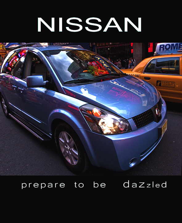
I don't like the spacing or the strange sizes of the letters on the bottom, but I love everything else.Great color, great reflections, nice bold font for "Nissan," fitting distortion, and sharp detail. The crop on the back and top might be a little tight, but I even light the inclusion of the cab because that paired with everything else (distortion, reflections, etc) help make the point that the car is hip and great for a city.
There are a lot of distracting elements in this photo. The taxi behind, the lights behind, and especially the reflection of the lights in the bodywork all interfer with the photo. Cropping off the rear bumper is also an issue, and overall the crop is too tight around the car.
i like how the lights of Times Square seem to give this an almost lightning like appearance - the choice of wide angle does give the car a bit of distorted look but i think it works okay here
Nice and crisp. However, the rear of the car is cropped out, would have been better if the back wasn't cut off. I would have liked the side of the car lightened up a bit (if possible) to be able to see details of the car. Just my honest critique.





 Add photograph to your favorites
 Add photographer to your favorites


 Photographer found comment helpful.


