my first impression: WOW, then a few little things started grabbing my attention:
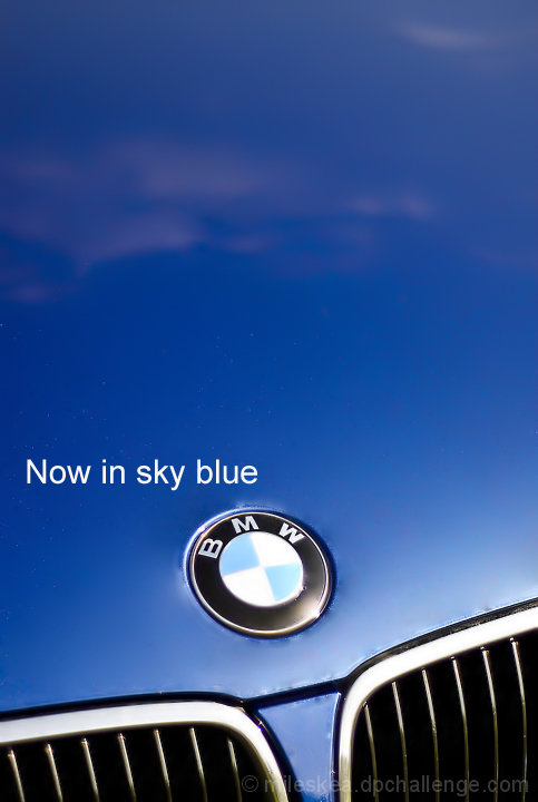
- you blurred the reflections on the hood, right? check the edges - artifacts remain and show the "fiddling" with the photo
- the blue ins the logo is too washed out.
I still like the concept of your shot. PP let you down.
Oh this photo perfect for this challenge. I wish that the clouds were more prevalent but I know that capturing reflected clouds in a car hood is kind of difficult. Just being nitpicky.
One of my top three picks. Your image is one of the very few in this challenge that I feel actually looks like an advertisement, instead of a photo trying to look like an advertisement. The reason that I love this so much is because I really love simple ads. Television ads shout at us all the time and so I really feel that an ad that has simply soft music or nothing at all, sound-wise, has more of an impact. This is the visual equivalent of that, and brings to mind the intelligent tone of some Mac ads or the slick, simple feel of the Google website. I love the image itself because the white at top, to mimic clouds, is very visually appealing. The composition, both of the parts of the car and the placement of the text, is also appealing. I do think that to make it absolutely perfect, the "grainy" feel above the text and around the logo could be changed, but otherwise this is a wonderful advertisement and one of my favorites.





 Add photograph to your favorites
 Add photographer to your favorites

 Photographer found comment helpful.


