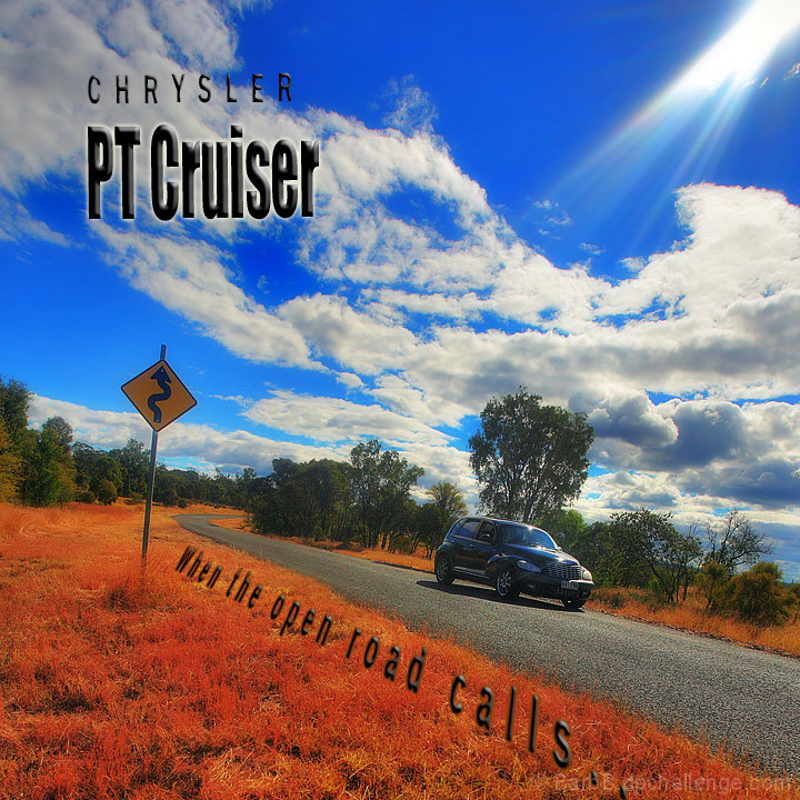
Great colours in this image, maybe a little over the top but I think that works int eh advertising world. All of the lines though seem to lead me away from the car. and towards the road sign. A close crop to make the car bigger and making it the main subject would have helped.
I really like the idea and the location of this one, and the way the lens flare seems to shine down on the car.
Couple of things I don't like though. The car is too far away, I would have liked the car to fill more of the frame, this feels more like an add for the location than the car.
Secondly is the text, I don't like any of it apart from the word "CHRYSLER". The white border around the "PT Cruiser" cheapens the add for me, and the sentence along the road just feels tacky. I think it might have worked in a video if the car was driving past, but I don't think it works at all in a still.
For the location and the shot itself I would have given you an 8, but for me it's let down by the text so I'm going with a 6.
Great photo, albeit a tad oversaturated. A little overboard on the text as well. Overall, I'll judge mostly on the photo merits and give this a 7. Good luck. :)
Excellent Colors & Awesome Photo Over-ALL! I'm curious to see how this use of Minimalism (as to the car) will play here at DPC! Yet, Striking Photo! Great Work! :)





 Add photograph to your favorites
 Add photographer to your favorites


 Photographer found comment helpful.


