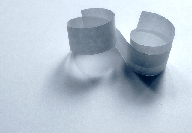
This is a really nice shot. simple yet very creative. one of my faves. not sure that the multiple light sources are readily apparent but I trust that they are there. I really love how you can see and feel the texture of the paper. Good use of negative space as well along with the compo. 9
hmmm. by rights, a curled up bit of white paper (looks like one side of bouble sided sticky tape) on a white background shouldn't be interesting. but it is! striking even! the different shades of greys are quite a draw, and i find myself staring at this... all the little nuances rock! i like a bit of minimalism, and by jove, i think this is it! the off centre position is totally right, and there's no way i'd alter this. good job matey! 9.
I like this image but to be honest, I can't really tell you why. I guess it's that it all works together. The complexity of the shadows is intriguing. "Is it a picture of the paper, or of the shadows?" is what I keep thinking about. Congratulations on a fine image. Hope it does well in the voting. (9)
Very nice use of multiple light sources. I like the color a lot and the composition is very appealing to me. I also really like the texture in this shot. I wouldn’t change anything about it.





 Add photograph to your favorites
 Add photographer to your favorites


 Photographer found comment helpful.


