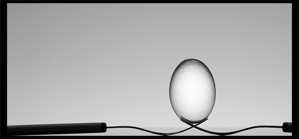
This is a reproduction of Dave Nitsche's Cradle as seen on onexposure.
Missing a light and a decent/seamless background to make it perfect.
Steps:
-Adjustments, rotate and convert to b&w from raw
-Crop, add border, resize, USM, resize
-Save for web
Post:
Wow! Thanks for all the votes and favorites! Hope I don't disappoint too many by this being a copy and not original work.
I saw Dave Nitsche's picture and thought; wow, I want this on my kitchen wall! This was over a month ago. While I had it in my mind, I kept forgetting to buy eggs. Then along came this challenge, and extra motivation :)
I completely agree with what yanko say, and I plan to keep working on it to get it up to the standards of the original. But that wasn't gonna work in basic.
Statistics
Place: 2 out of 166 Avg (all users): 6.8333 Avg (commenters): 7.6154 Avg (participants): 6.6667 Avg (non-participants): 6.9111 Views since voting: 6107 Views during voting: 393 Votes: 198 Comments: 32 Favorites: 13 (view)
Nicely done. Congrats on the Ribbon!!!!! For those interested mine was shot on a smith victor shooting stage with seamless white plexi. Really nice stuff. Flashing behind it gives some nice 'sunspot' lighitng.
The setup is pretty straight-forward:
-Forks and egg on edge of the table on a glass plate (tried to get some reflections, but that didn't work out too well)
-One SB-900 really close in front and below on 1/128 power
-One SB-600 behind lighting the wall on 1/32 power (I think)
Whilst this shot has been done before don't let the comments get you down, the voters still placed it where it is. There's very few original works on this site anymore anyway.
The problem with copying someone else's shot is you need to meet or exceed the original otherwise you're doomed to the inevitable comparision. Unfortunately, since this one doesn't have the originality/creativity associated with it your technicals needed to be better just to break even, which is why it's better to just try out something new. It's that whole risk/reward thing, which you're avoiding here.
That said, I understand people try to recreate a photo just to learn but bare in mind that as a voter I must consider more than just the technicals, which is all you have focused on here so you lose a lot in the voting from me.
This is fun. I like the arrangement of objects and the overall composition. The heavy side borders is becoming an item when it shouldn't be. This would have really popped with a simple single white pixel with 5-10 pixels of black outside the white.






 Cradle
 Add photograph to your favorites
 Add photographer to your favorites


 Photographer found comment helpful.


