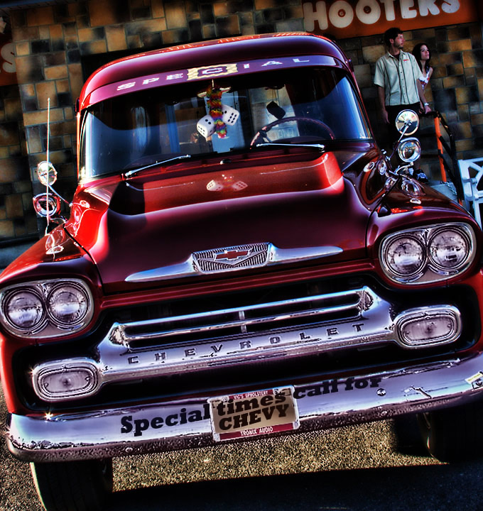
An interesting angle of this photo, which I am not sure it works. It helps add interest, but is seems awkward as well. Cropping out the edges of things (the left headlight surround, the right bumper) doesn't work for me and gives an incomplete feel.
This was the first one up on my screen when I came to voting and what a great one to start with!
Great shot with beautiful colours! I like everything about this apart from the slight darkening across the top left hand side, and while I know that's just the pattern on the wall, it takes away from the overall picture for me (yep, call me fussy!).
I can't actually tell if the text along the front bumper is something you added in photoshop or something that's physically on the car, I'm leaning towards the latter as it's not completely straight towards the end but I might be wrong.
I think you might lose some points on this for cutting out the left and right sides, but I like it, I think it suits the style of shot!





 Add photograph to your favorites
 Add photographer to your favorites

 Photographer found comment helpful.


