Sorry you did not score higher with this image, I thought it was a fun entry.
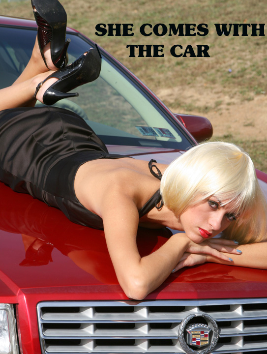
This is sort of reminiscent of the 1970's style car shows, where beautiful women would be draped all over the cars on the stands.
I think the font also has a very 1970's feel to it, which may very well have cost you a few points as far as DPC is concerned. The car feels as though it is framed a bit too tightly. I would really like to see a little bit more of the car itself. Somebody else commented about the badge of the Cadillac being cut off, this likely cost you a few points. I have come to realise over the years on DPC, it is these really small details that typically make the difference between a lowish/average score and a higher score.
Well done though, for even though it didn't score so well, I think it was a very well conceived idea.
That would be nice.........Very different image that is well executed. Classical car ad rather than the more modern ones we have seen in the rest of the challenge.
Well, let me qualify my comments with this. If you were submitting this just for fun/laughs, I got a kick out of this. Too funny. Another high maintenance accessory with a high maintenance car. :)
On the serious side (if this was a serious submission), you probably should have picked a font matching the Cadillac style. Probably shouldn't have cut off the bottom of the Caddy emblem. Maybe tried a head on shot of the Caddy with the model centered above the emblem. And finally, the model's lipstick matches the car, maybe had the model paint her nails red too....
I wish the background were a little more exciting or colorful, as opposed to simply a grassy hill. Great angles, and I really like the model's look, though! Phenomenal title, as well!





 Add photograph to your favorites
 Add photographer to your favorites


