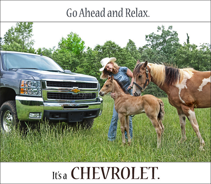
This is what I saw in my head the minute the challenge was announced.
It was a bit more difficult than I anticipated... just convincing Hubby to take my car to work instead of his truck and then washing Hubby's truck was hard enough.
Getting my non-cowgirl daughter to wear the outfit was a breeze... she's so willing to model for me (see her in my recently-ended "Glamour" challenge entry), but getting both horses to stand in a pleasing pose at the same time while daughter didn't look like she was working (she definitely was!) was a difficult task, indeed.
I'm pleased with it and think it's a good automobile ad, although the photographer can still be seen vaguely in the bumper reflection. I hope you do too. :)
My guess... ummm... 6.1
[May. 25th, 2009 12:25:46 AM]
*sigh* 4 votes 5.5000
Statistics
Place: 23 out of 68 Avg (all users): 6.0058 Avg (commenters): 6.9167 Avg (participants): 5.4516 Avg (non-participants): 6.1277 Views since voting: 1762 Views during voting: 392 Votes: 172 Comments: 13 Favorites: 0
I like the overall composition Idea, however the crop on the car just seems a little awkward to me. Keeping a little more of the car in the shot may have helped.
Such a creative idea and slogan. The truck pops really well to me. I like this because the Horses didn't pull me away from seeing the truck first. Once they hit, it just pulls it all together.
I think this shot is overall very well done. The only thing I don't like is the font of the word "Chevrolet." Test that has even the tiniest bit of stylizing gives a fun, relaxed, un-serious feel. That works exactly as it should for the top line (the feel of the text conveys *exactly* what the text says), but the only reason why you can relax is because the Chevy is strong, tough, serious, etc, which is why I think it would have been much more powerful if the "Chevrolet" was in a heavy bold text. The way the name brand is portrayed is almost more important than how the item being sold is portrayed : ) But like I said, I really like the rest of the shot!
I like the idea and message you are sending across here, and it does feel like a well targeted ad, but I don't like the actual composition.
There's just not enough of the car in it, and it's not like one of those ads where it's all dark and you catch little glimpses of what looks like a great car, you've actually just cut most of it out!
This is fantastic. Gorgeous foal, love the curly hair! The ad screams Americana, although I'm not sure I understand the upper text. That said, the photograph is excellent.





 Add photograph to your favorites
 Add photographer to your favorites


 Photographer found comment helpful.


