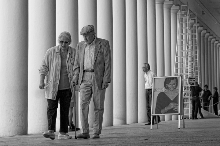
Love all the lines everywhere, and the repeating people as well. To my eyes, the front couple seem to lack a little contrast, perhaps a local boost would give them a little more pop.
Hi Deb
Can't comment as to B&W technique, but think the couple looks sufficiently highlighted..what grabbed my eye was the contrast (no pun intended) b/tw the youth of the gal in the floor poster and the couple, surrounded by all that geometry..including the workers all matching in their black outfits and adding those vertical "lines" with the ladders and columns.
It looks somewhat flat, but I don't know how to add more contrast without overreacting. Nice gradients on the columns. Perhaps a square crop? Although that would add a lot of attention to the leg between the couple.
Yeah, and it's too busy and I don't know what I'm supposed to be looking at and it doesn't fit the challenge and where's the instruction manual and why do they always write those things in languages I don't understand?
Oh.
It's tricky. A higher contrast would be typically 'right' for the photograph as an abstraction, but the couple that are hogging the discourse are (quint?)essentially quiet and calm, something with which jazzed up contrast would clash.
It's a lovely picture, you're on a calm and quiet roll with these.






 Add photograph to your favorites
 Add photographer to your favorites

 Photographer found comment helpful.


