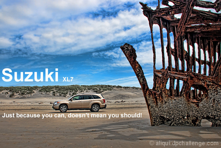
I was out shooting the Peter Iredale wreckage, and a car drove by. I said "what the hell??" When the next guy drove by I was ready. I panned that bastid! I didn't even know this was a challenge at the time, so I'm glad I did.
Topaz Adjust
Brightness/Contrast
Shadow/Highlight
Crop
Resize
Sharpen
Sharpening tool on select areas
Burn
Hue/Saturation to reduce yellows
Text
Statistics
Place: 20 out of 68 Avg (all users): 6.1491 Avg (commenters): 6.5714 Avg (participants): 5.9032 Avg (non-participants): 6.2077 Views since voting: 1569 Views during voting: 382 Votes: 161 Comments: 15 Favorites: 0
It was interesting just now reading through the comments, I was amazed how many people didn't get the tagline. I thought it was self evident, but there ya go!
Composition in this image is very strong, although perhaps the shipwreck does over power the car a little. I know it was luck that you managed to get this shot and that it was not a set up, so the car colour was not optional, but that said, I do think a stronger coloured car would have helped. As this was an advanced challenge, I wonder if you could have switched the colour of the car for something else? Just a thought and probably a silly one at that.
It's interesting to watch how the trends come and go on DPC. Currently Topaz Adjust is all the rage and I can see you have used it here. I think used with a bit of discretion this tool can really enhance the processing of some images, but to be perfectly honest, I think it is a little bit too heavy in this image and it has spoilt the quality of the image a bit. I may be the only one thinking like this however, as you did indeed get a decent score.
Like I said, good strong composition, that was hurt a little for me, by a bit of heavy processing.
Is this the famous Oregon beach wreck? Had no idea it was so large, or is it?
I just Googled it, yes it's the shipwreck near Astoria, OR. (I live in Oregon, I just learned something today...)
There's apparently several shipwrecks in the area, but this one is by far the easiest to get to. It's just a quick 2 minute trek through the sand from the parking lot.
As for the slogan used, I'm not sure where the cars were gaining access to the beach, but "just because they can, doesn't mean they should!" I couldn't believe that there were cars driving that close to such a fragile historical landmark. There's parts of the wreckage that are just barely poking through the sand. Dangerous for both the drivers and the wreckage.
I like the composition of this image. Even though the wreak is so much bigger, the car is still the subject, just by the placement of the elements. Like a few other photos, maybe a different car colour would have been better to avoid it blending in (yes, borrow a Red One......) but that is not something easily done.
Would have preferred the bottom line of text to be closer to the bottom of the ad. I think the top line is really well positioned, but the other line could have gone along the very bottom almost, and been a better placement.
A great submission for the challenge
I personally don't get the tag line, but I'm not judging the tag line or font. With that said, I do like how you placed the text over and under the vehicle. This technique further draws the viewer's attention to the vehicle. Nice job there. I like the composition, the vehicle looks nicely focused. In my opinion, I like the "balance" of the image with the shipwreck, the vehicle and dunes and even the sky. I think the clouds give the sky "balance" to the ship. I think this is nicely done.
I absolutely love the left side of this image. The color of the car fits nicely with the theme, but it still stands out from the sand. The object on the right is super distracting to me, though - and seems a tad over processed. Seriously, great work with the car, sky, sand, though!






 Add photograph to your favorites
 Add photographer to your favorites

 Photographer found comment helpful.


