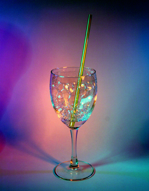
this is very nice - wine glasses are hardly original, i admit, but the addition of bubbles is sheer brilliance. i can clearly see that the piece has been illuminated from different sources, as per the requirements. i'm in two minds about the inclusion of the straw, because even though it affects the overall simplicity of the image, i do think it really ought to be there. the lighting and greens are very good... it's a shame that spot editting isn't allowed, because there's a slightly distracting splodge on the right... and did you consider using neatimage et al? the colours are striking, and overall this is a definite top 10 favourite of the week. 8.
Lighting is well done and "obvious" use of multiple sources. Colors really work well. Not sure the bubbles actually add anything - it may have done well with just a plain clear liquid - perhaps with a hint of food coloring. Straw adds a good graphice. Overall - a very strong entry that should do quite well.
great idea. the colors look a little too artifical for me though (post processing?) I think a tighter crop on just the glass makes for a nice picture too.






 Add photograph to your favorites
 Add photographer to your favorites

 Photographer found comment helpful.


