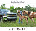
I love any excuse to photograph my car and this is definitely a good excuse. I couldn't decide whether I wanted the top print in the sky and only have the border at the bottom or have borders on both top and bottom. I think I like this way best though. Also, another text issue I toyed with was whether I wanted to add "Ford Motor Company" under bold moves or not. I think having it under it identifies the company and being an ad I figure that would be important. I would rather have the Ford logo in front of the words "BOLD MOVES" but figured that would quickly turn into a DQ.
I chose this photo out of 2 that I really liked but am waiting for the nay-sayer's to tell me that the horizon is not level. I thought it didn't make much difference being that the main subject and focus is the car and the eye should not really wander to a meaningless horizon. I also thought that the horizon matched the angle in the yellow lines in the road nicely. I guess I'll see in the comments.
Taken at 18mm
PP:
shadows/highlights
curves
Dodged the headlights and pony emblem as well as a few bright areas of the car
selective color on the blacks and blues
USM
downsized and save for web
Here's the outtake:
Statistics
Place: 24 out of 68 Avg (all users): 5.9461 Avg (commenters): 6.8889 Avg (participants): 5.8000 Avg (non-participants): 5.9781 Views since voting: 1338 Views during voting: 395 Votes: 167 Comments: 13 Favorites: 0
I think cloning out that bridge would have been a DQ.
Originally posted by kaiser_chief:
Great overall compostion and a really professional looking submission here. Only one small distraction/improvement. Cloneing out (probably legal under these rules) or a slight position change to remove the structure behind the car on the right would have added to the clean image look.
Great overall compostion and a really professional looking submission here. Only one small distraction/improvement. Cloneing out (probably legal under these rules) or a slight position change to remove the structure behind the car on the right would have added to the clean image look.
The saying at the top is great (props if you made it up yourself!), but I think the image would have looked a bit more bold with a less distracting background, particularly on the right. Maybe blur out the background? It might look cool with a gradient blur so it looks like an incredibly shallow depth of field.






 Add photograph to your favorites
 Add photographer to your favorites


 Photographer found comment helpful.


