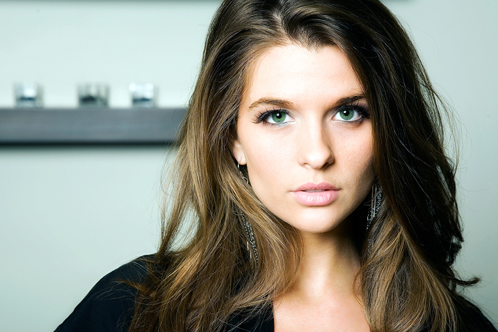
This is Amanda. You can find her on Model Mayhem here. This is the second time we have shot with Amanda at a Rick Hughes workshop. Hope you like it.
[May. 26th, 2009 05:32:02 PM]
++++++++++++++++++++++++++++++++++++
I'll agree with y'all that the shelf growing out of her head is distracting. At the workshop we were at, this pretty lady was placed on a bar counter with 1 octobox in front, and we were told to shoot what we wanted.
This
was one of the first shots, but I was looking for something different. My vision all along was to clone out the dang shelf. I didn't realize that there was a glamour challenge on. I decided to shoehorn this one in as is.
This is what I would have submitted if I didn't care about being DQ'd.
Statistics
Place: 3 out of 83 Avg (all users): 7.1472 Avg (commenters): 7.8000 Avg (participants): 6.5172 Avg (non-participants): 7.2246 Views since voting: 8359 Views during voting: 666 Votes: 265 Comments: 43 Favorites: 19 (view)
She has so much more personality (and is so much better looking) in your shots than in the others on Model Mayhem. Especially compared to her lingerie/bikini shots, which you'd think would be sexier... yours are way beyond those.
I mean no disrespect to your considerable photographic talents, but I can't help but think that if I dug out my old Brownie Starmite camera and photographed this model the resulting photo would still look pretty good. Of course, your photo is well beyond "pretty good".
Pretty girl! Not gonna lie, if you hadn't posted the other pictures or acknowledged that it's a shelf, I definitely would've concluded that it was a large ship in the background. Don't judge me.
PostLuminous Award Nominee!
wonderful! And the oof shelf in the background actually helps this image quite a bit: you used the appropriate dof to blur it, which means it is not a distracting thing growing out of her head, as it is clearly in the background, but it provides a sense of depth, gives her a 3d presence in the image, which might have otherwise seemed a bit flat. A well-deserved ribbon.
I didn't vote in this challenge, and I admit, I didn't think this shot would get a ribbon. Lighting, pose, and colors are very good, but I thought that shelf behind was way too distracting, and knowing DPCers, I thought many would have given this shot a low score, but then again, DPCers always prove me wrong!!! LOL I do have to congratulate you both on your ribbon and your bravery!
I have to admit, when I saw this image I was blown away that it was on the front page. With how picky and anal the voters are, to put this image on the front page with the distraction in the background just boggles my mind. The model is beautiful, it has great lighting on her, but that background literally kills what could have been a really great image. Congrats on the ribbon.
Yes it is truly mind-boggling.
Ya know, I really agree that the shelf is a distraction. I say that up in the Photographer's Comments. I would rather NOT have had the shelf in the shot. But yet, there it is. And for some reason, voters liked the shot anyway. Go figure.
I have to admit, when I saw this image I was blown away that it was on the front page. With how picky and anal the voters are, to put this image on the front page with the distraction in the background just boggles my mind. The model is beautiful, it has great lighting on her, but that background literally kills what could have been a really great image. Congrats on the ribbon.
Very good. I can't decide if there's too much light on the left side or not, but the color is great, especially those eyes. My personal fave from this competition!
Amanda should be a supermodel...stunning...My only complaint is the background distraction...wow, what an amazing face and eyes...I think this had more potential if it was cropped better and we didn't have the background you chose...I love the way Amanda's eyes lock in with the camera...stunning, stunning, stunning 8
Besides her being beautiful and "glamourous", I like the lighting, the offset, rule of thirds use, and I even like the blurred background! I don't know why I like the background but it just gives you something there, sort of pointing out her beauty vs. it's Not! Just my thoughts!
thanks for showing us, and I am not a glamour kind of shooter so take it with a grain of salt!
Fantastic headshot, lovely lighting and expression, as well as the crop works well. It's just lacking the atmosphere slightly of my top five but a definite top 10 finish for this and an 8 from me.
great shot of a beautiful woman, terrific lighting, nice subtle processing. But why, why did you choose to use this shelf as a background?! absolutely unnecessary IMO. Generally i like non-empty backgrounds, but in this case even a blank wall would be better than this shelf sticking out of her head.
I like everything about this photo other than that shelf in the background. Drop-dead gorgeous model, perfect makeup and lighting, great crop & composition, and spot-on post-processing (such a rare thing to see sharpening done right here on DPC!). But despite all that I just keep getting distracted by that darn shelf...
I bet you put that shelf in the BG to see if anyone would notice it. First, of course, they would have to drag their eyes away from that dazzling model.
I think the way you composed the model and cropped/framed the image is fine. The lighting is good, but maybe a touch harsh. Focus is right on; her eyes are captivating. The negative aspect is the shelf(?) in the background. It unnecessarily draws away from the model, which is a great glam shot. Just my honest critique.
I love your lighting on the girl, and she's very glamorous, but I find that shelf in the background really distracting and cold, it doesn't seem to add to the image in any way. Gorgeous work on the girl though.







 Amanda
 Add photograph to your favorites
 Add photographer to your favorites



 Photographer found comment helpful.