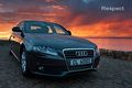
Pretty slick. The glow is so over the top but it definitely helps to make this one stand out from the pack. Since this was advance editing the clipped highlights should have been fixed and I think you missed a spot when blurring the background (i.e. near the bumper). Other than that very professional. Congrats.
I did not vote on this challenge (just commented on a couple of images and this was one of them). It sure looks like an ad, and it's so good at it that the issues pointed out by Yanko do not detract..and that tells a lot about the excellence of the overall work.. so huge congrats on the entry, the ribbon and the new PB!!!
In regards to "you missed a spot when blurring the background (i.e. near the bumper)". It brings up a doubt I have always had in regards to the extent of "legal" blurring.
The rule says the blur filter can be applied as long as it doesn´t change the way a viewer would have described the original image. Would it be legal to use bluring to get rid of some people and cars or buildings on the background, or the activity inside the building?. Could someone clarify please?
Very professional! Nothing needs to be done to this at all to be an actual car ad. You should take a print to the dealer where you shot this! Oh, and congrats on the ribbon and the new PB!
Pretty slick. The glow is so over the top but it definitely helps to make this one stand out from the pack. Since this was advance editing the clipped highlights should have been fixed and I think you missed a spot when blurring the background (i.e. near the bumper). Other than that very professional. Congrats.
The overdone processing of this works for some reason. It is something that you often see with car ads, and you have pulled it off effectively with this shot. A really professional looking submission that could easily be mistaken for something already in a magazine. Great job
Such an eye popper! This just has people drooling all over it. Such talent in this capture. A lot of amazing photos in this challenge and here I sit viewing another. Crossing my fingers for a top 5 for you.
the concept is great. placement of the car is well donw against the dealership. What is distracting is the processing. It seems to be rushed with little care aroung the edges of the car (blurring the background). In advaced editing you could have duplicated the layer,blurred the background and then with a layer mask painted the car back in.
Is SO MUCH blurring legal?. Other than that a good composition, color control and graphic design.
A left hand drive with a London plate? :-) It must be another London somewhere.
excellent advertisement - very cool take with great color choice and lighting - the blurring of the background really allows us to focus our eyes - one of the best by far of the challenge
One of my top three picks. Your image is one of the very few in this challenge that I feel actually looks like an advertisement, instead of a photo trying to look like an advertisement. I love the fact that you have the Infiniti building in the image - it helps to "sell" the shot. I also like the text that you included, because it seems very professional. The colors throughout the image are very nice and I like the blurring and lighting effect, although it may be just a tad bit too strong for my tastes. Very good job at making a professional looking advertisement.
The best of the lot. Terrific use of border, text, location. Well done. Looks just like a car brochure ad. And I should know. My hubby (and I for that matter) has been in the car business for 27 years. :~)






 Infiniti FX
 Add photograph to your favorites
 Add photographer to your favorites

 Photographer found comment helpful.


