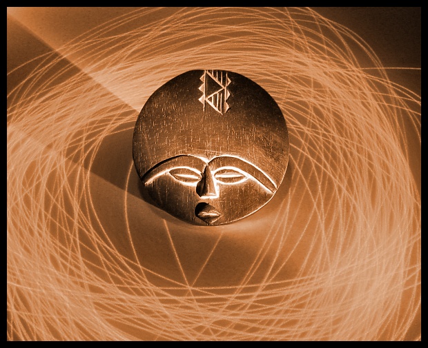
this is a lovely piece of illuminatory art. the sepia tones, the whooshy whooshy light, and the way the edges of the raised bits glow (thereby conveying a three-dimensional appearance and gives a strong impression of feel) really appeals to me. the shadow makes it a tiny bit unbalanced in terms of symmetry, but that aside i think that this is very well composed and taken photograph. excellent - 9.
I think a slight crop on the right would have been a little better. You have it just off center, which doesn't work. I think it would either need to be way off center, or in the center.
I like this though, it's really nice. I'm digging the color. 7.
Very nice photo. I like the effect and the title. The highlights on the mask look a little overexposed, but other than that the exposure is pretty good.
Intersting cropping and composition. A sense of dried staw in that light painting, somehow, which also somehow seems apt to the image. Neat work. Has a sense of 1970's design to it also.





 Add photograph to your favorites
 Add photographer to your favorites


 Photographer found comment helpful.


