Hi Michael and * Greetings from the Critique Club *
Your very first submission - congratulations!
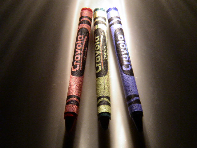
3 primary colors 2004
Does it meet the challenge Yes, without a doubt.
Technical stuff Composition: It's a bit centered - may work a bit better if the camera was rotated so that the crayons were in a diagonal composition. That would also remove the complaint noted by your commenter that there wasn't much on the left and right edges.
Exposure: It's a great exposure for the lighting used, but the shadows block out the crayon tips as noted by several commenters. A secondary light source or reflector would help a lot.
Focus: Spot on given the lighting conditions.
Overall Impact It's a great idea executed well. It just didn't have the additional "wow" factor to make voters rate it higher. The flaws in the subject (lines on the crayons) and the title (green isn't primary) probably cost you points from a few who scored this.
neat lighting!! i wonder what it is... clever idea, as well, although the line down the center of the green and red crayons is extremely distracting.. some noise and dust specs, but overall a cool pic
Good idea, but the light is so harsh that you lose much of the color saturation that you're trying to emphasize. The fronts are in total shadow and the backs are blown out. A piece of white paper held in front to bounce light on the tips would have helped. The streaky light effect is a plus, but the dark marks on the crayons themselves are a minus.
I like your lighting - it really moves your eye over the subject. Wish there had been a bounce at the bottom to reflect light back at the tips of the crayons so we could see them better. The crayons themselves are burnt out in spots, but the low light gives nice texture. Maybe crop the sides a bit?





 Add photograph to your favorites
 Add photographer to your favorites


 Photographer found comment helpful.


