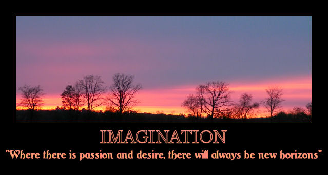
I like the saying matching the photo, but I feel the title does not tie in as well with it. I feel there needs to be a little more of the dark ground to balance this photo. You cropped too much of the lower part out for me. It also feels like it is not straight as a result of the uneven ground. For some reason, it feels like the left hand side is higher than it should be.
Also, the border and the writing appear to be different colours. I would have used the pink for both. The orange looks a little boring and washed out, and not the bright, vibrant colour it should be. |





 Add photograph to your favorites
 Add photographer to your favorites


