Author Thread Comments Made During the Challenge
Post actions
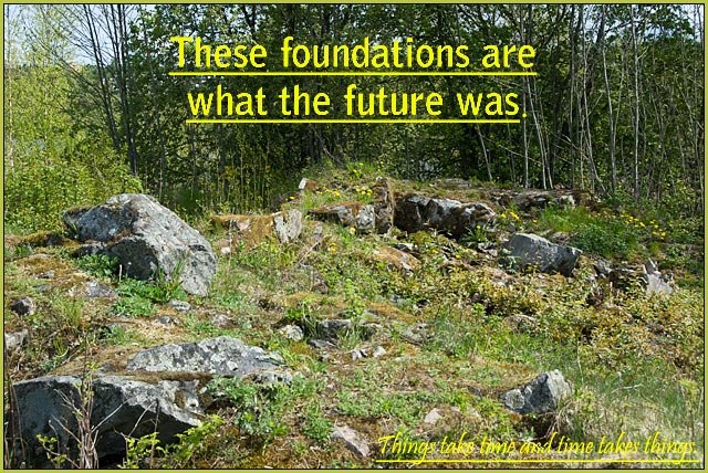
Poor choice of placement for the secondary line.
Post actions
you may know what it says in the lower right, but i don't
Post actions
the quality of the photo is bad, and the yellow font doesn't fit in, I wish u had a better frame
Post actions
the bright yellow letters and underlining bother me (can barely read text bottom right)but smart concept
Post actions
Yellow text at bottom right hard to read
Post actions
The lower quote is a little hard to read. Not sure I'd hang it on my wall to de-motivate.
Post actions
There is very little contrast on the words in the lower right -- it took me a while to notice. While it is a nice photo, it does not do anything for me.
Post actions
Post actions
Not sure I am understanding the message to this one. Everything wears down over time? Nothing gets done if you don't fininsh what you start?
Post actions
Text isn't traditional "motivational poster" style, with contrasting background, so it is difficult to read, especially the punchline.
Post actions
text colour choice is very hard to read. :(






 Add photograph to your favorites
 Add photographer to your favorites


 Photographer found comment helpful.


