|
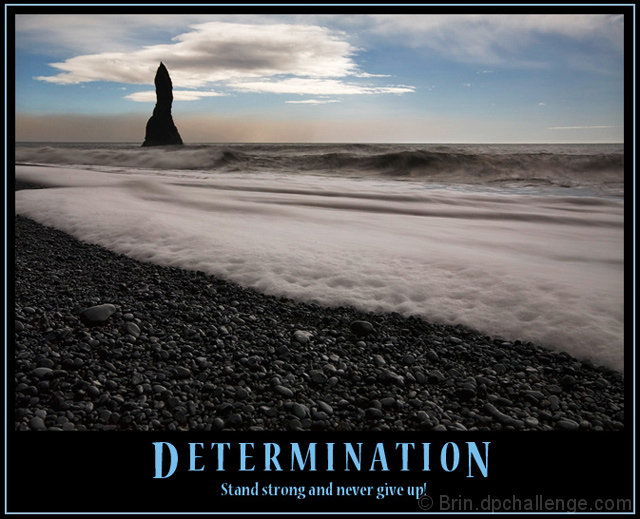
A nice image, having a little more sky would have put the horizon on the third line and really balanced this photo. i currently feel the subject, the pillar, is a little too high in the image. other than that, a really well composed and presented poster |





 Add photograph to your favorites
 Add photographer to your favorites


 Photographer found comment helpful.


