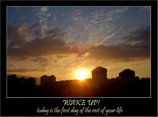
nice photo, and nice overall combination. The phrase and title match the photo and compliment each part well.
The photo is good, but perhaps the sun being centred maybe isn't the strongest thing. Having it to one side, on the third line, may have helped against this, and given an even more broad range of colours. Further to that, a little extra dark foreground would also have balanced this photo much more.
Don't know why you opted for the text colour being different from the border. Having both of these in the blue would have kept the entire poster together more and given a more finished and professional look. |





 Add photograph to your favorites
 Add photographer to your favorites


 Photographer found comment helpful.


