Well, I had a diffrent entry I had intended to try, but wasn't happy with it.
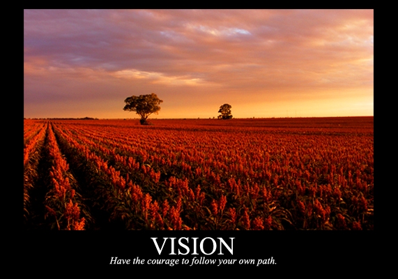
So today, as I was driving down the paddock to feed the horse I was able to get some shots of the sun over the crop.
Not sure how this will go with voting, but oh well.
Editing was just Brightness/Contrast & Saturation Adjustment layers I think.
Statistics
Place: 17 out of 134 Avg (all users): 6.1415 Avg (commenters): 7.9091 Avg (participants): 5.9643 Avg (non-participants): 6.2051 Views since voting: 1845 Views during voting: 409 Votes: 212 Comments: 11 Favorites: 0
A great image for a poster, with some great colours in there. That there is no strong subject in this image works very well, and ties in exceptionally well with the title and phrase. This poster lacks the border that is common to these posters, and the choice of text colour doesn't tie in well to the picture. Adding these would then have made this look like one you could buy from a shop.
one of my favorites this challenge ... like the soft tones and focus ... would have liked the photo to pull out from the border for a bit more definition at the bottom
In my belief there are more things that contribute for a great motivational/de-motivational poster:
Idea/creativity: 4
Quality of the photo: 8
Artistic viewpoint: 4
Frame/borders: 3
Appealence of the font: 4
Average: 4.6 (5)
love the colors. the text should have been adapted to the scene though (no path there - at least, no obvious one). on the other end, 'vision' fits very well.





 Add photograph to your favorites
 Add photographer to your favorites


 Photographer found comment helpful.
