|
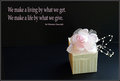
Ducky's, and very effective. A good image to match the title and saying, which ties the who poster together. The spots on the ground on the right however are a problem, and a shame you couldn't clean it up under this editing ruleset. The light is a little harsh maybe. I understand having it come from that direction, and like the shadows that will create, but the chest/top of head areas are a little too bright in my opinion...... |







 Add photograph to your favorites
 Add photographer to your favorites


 Photographer found comment helpful.


