The last image to vote on and comment............
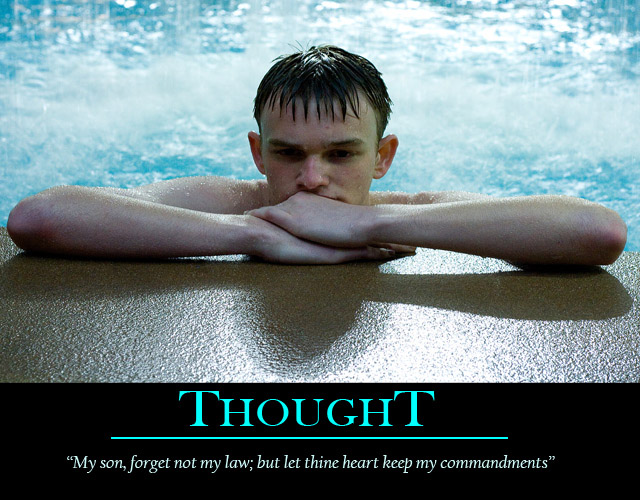
Great overall poster composition. I think that you got the overall presentation spot on, the colours and text right, and avoiding the overall black border in thsi case works really well for me.
Maybe a little extra diffused light onto his face, just to avoid the dark eyes that you have here, may have worked. But hey, overall, an image that fits in exceptionally well with the title and phrase you have chosen, and a really good overall submission. |





 Add photograph to your favorites
 Add photographer to your favorites


 Photographer found comment helpful.