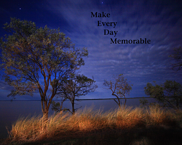
This is a great image. To me the text is weak and the black hides in the image. It might work better if the traditional motivational poster border was used and the text was placed in the border.
On first galnce, I really like the photo, but as I look into it more, there are a number of things that catch my eye. The tree on the left is blown to the left, making me tilt my head, and you have cropped off the very edge of it. More space to the left was needed to balance this photo. it is currently too far to the left in the frame to be the subject, yet is the most dominating part. it needs to sit ont eh third line, prefeably the right third due to the lean. Trees are cropped off on the right, which also makes it look unfinished. Further to that, the writing just seems to blend in a little too much, rather than making the bold statement it should make......
Not sure about the text inside the picture, the angle of view and the shadow in the foreground. But my wife loves it and I have to admit it has very pleasing colour tones.
This photo lacks of a border (I'd prefer there to be one, consider it as you were writting a motivational letter and following certain rules) I like the message but the font and color aren't that good, they ruin maybe the best looking area in the photo






 Add photograph to your favorites
 Add photographer to your favorites


 Photographer found comment helpful.


