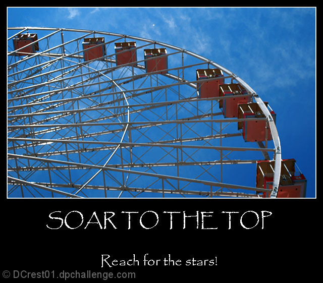
An interesting image, made by the geometric patterns created by the structure and the angle that we are viewing it from. The criss cross of structure provides all these shapes and patterns that draws attention.......
The blue sky is brilliant, maybe the red could have been adjusted slightly to also make it more vibrant, which would have added to this overall image.
The presentationoverall is good, without being exceptional. The title and phrases probably could ahve been tailored a little more, and more traditional (ie Title: Soar, Phrase: Have the Courage to Reach for the Stars) A little more traditional motivational poster, and with different text fonts it could have been mistaken then for one from the shops
There is something now quite right about this picture,
Not sure what is that, it could be a bet of noise in here, not sharp enough, a mix of both.
If you are mentioning stars in your text, I'd like to see it in the pictures.
This is of course my humble opinion, I hope my comment is taken in a positive way, all the best, 6






 Add photograph to your favorites
 Add photographer to your favorites


 Photographer found comment helpful.


