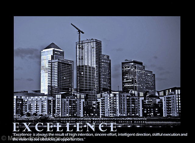
the text goes into the photo, and what's worse the color of the photo and the text that goes into it are same, and that's not good...I wish you refered to your motivational message when you were editing this photo
The image works well with the saying. however you needed to have a larger area at the bottom so that the text does not sit over the image. For me, the writing and the lower lights are fighting, and it doesn't work. Also, I would prefer the words to be centre aligned, and not to the left.
The colour in the city is good, the crane is perfect for this, adds to the image and makes the statement. I like the image and the processing you have done, the exposure is good. With changes to the presentation, this could have been a very high scoring submission





 Add photograph to your favorites
 Add photographer to your favorites


 Photographer found comment helpful.


