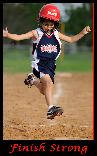
As you should. Would have preferred a stronger title/phrase combination that is traditional of motivational posters. The image you have chosen fits the challenge well, and the capture is very good in mid air. However the crop lets it down with this. I feel that you needed more space all around the photo. The right hand is cropped off, there is no space above the head, and the base is cropped out. It is like he is jumping out of the page as you have given nowhere to land, no space where he is headed.





 Add photograph to your favorites
 Add photographer to your favorites


 Photographer found comment helpful.