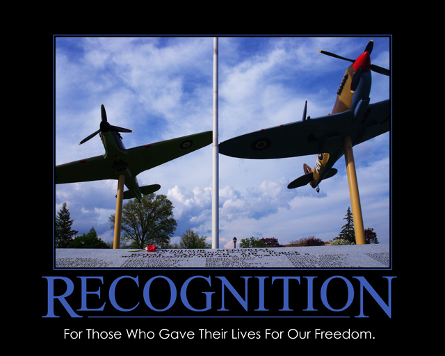
Cropping off the aircraft wings for me in this image makes it seem a little incomplete. The darkness of the underside of the wings also create large, black areas, whereas some fill light would have shown these with some detail which would have made this photo. Some additional foreground with the names on the wall, giving this more prominance, would have then made the names of the fallen the clear subject of the photo, and therefore made a stronger statement overall.
The title and phrase do tie in really well with the photo, and with the changes mentioned above, this could then have been one of my highest rated photos in the challenge
I like the sentiment, but I don't think this is something that would be found hanging on a corporate wall to motivate employees. The photo seems a bit odd as well, being cropped pretty tight and with that flagpole down the middle.
Maybe I am missing the point (sorry for being thick), but I find nothing here which would motivate me. I feel it could be a stronger composition in vertical format, showing only half of this image, with a wider angle.
In my belief there are more things that contribute for a great motivational/de-motivational poster:
Idea/creativity:5
Quality of the photo:5
Artistic viewpoint:3
Frame/borders:5
Appealence of the font:5
Average: 4.6 (5)





 Add photograph to your favorites
 Add photographer to your favorites


 Photographer found comment helpful.


