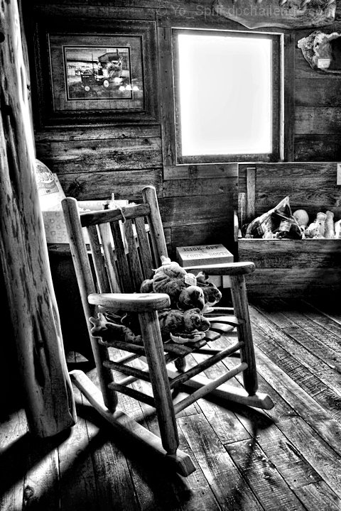
A child's size rocking chair sitting in the corner on the upper floor of this place:
I really like the play of the light and shadows on the floor. Hopefully that is enough to overcome the possible flaw of the blown light coming in the window. Not sure how that window will come off. Lack of an outside image may be seen as a flaw, or it could help to focus the viewers eye on the rest of the scene instead. I think it works.
Topaz adjust prior to conversion to b/w. Some selective editing to reduce the blown appearance around the window. Cloned out a couple of price tags on several items.
Pre-challenge notes:
I'm pleased with how this came out, and I'd hope this is good for a high 5, but don't really know for sure. I expect the blown window may hurt it some.
Post-challenge notes:
Came in a little higher than hoped for, which is always nice. I can't argue with the comment about overprocessed, however. It did give it a pleasing appearance, but I knew there are always some folks that don't care for when the image gets close to not looking like a photo anymore. I need to learn how to get some wow with a lighter hand on the PP.
Statistics
Place: 13 out of 98 Avg (all users): 6.0385 Avg (commenters): 7.5000 Avg (participants): 5.7917 Avg (non-participants): 6.1829 Views since voting: 1733 Views during voting: 267 Votes: 130 Comments: 13 Favorites: 2 (view)
I think this is processed just right for what it is. And now that the challenge is over, if you wish, you can "put" something in the window. Make it a picture, put in some curtains, add an outdoor view, whatever! Or just leave as is - as you pointed out, it's kinda cool the way it is.
Really nice use of processing to give it just the right feel. I really like the image a lot and more than a bit surprised it did not score better - but no 1s or 2s...!






 Add photograph to your favorites
 Add photographer to your favorites


 Photographer found comment helpful.


