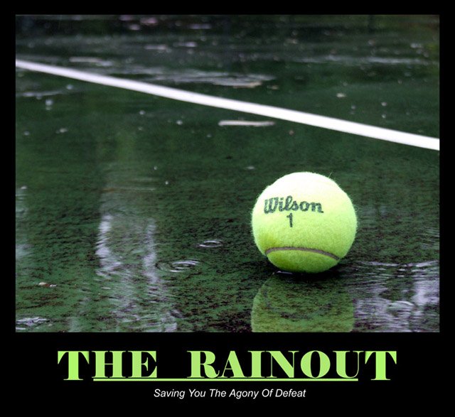
The colors look quite washed out here and the poster has a fairly gloomy feel that does go well together with the message. I guess not everything about demotivational has to be bright and colorful. :)
i personally feel this picture would be stronger if the "wilson" logo wasn't so... perfect. make it look like it was left there, not placed there, ya know? good otherwise though!







 Add photograph to your favorites
 Add photographer to your favorites


 Photographer found comment helpful.


