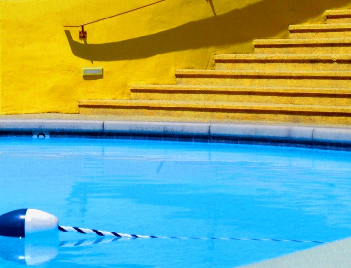
Great colors, lighting and shadows.
I'm not fond of the fact that you left the floater line in your crop. I think a better crop would cut out much of the lower section. I think as it is currently you lose the strong contrasting color impact. With the different crop the viewer would still recognize it as a pool due to the depth marker. No need in this case to spell it out to them with the floater line.
Another option that probably would have been acceptable in Advanced editing would be to clone out the lower right corner, and just make the water carry all the way across. The floater may not have been as noticeable without that corner being so different. As it is, it really draws your eye down, which in turn brings attention to the floater line. |







 Add photograph to your favorites
 Add photographer to your favorites


 Photographer found comment helpful.
