|
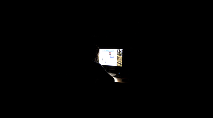
While the author's intent is clear, a little closer look at the computer screen and subject would have improved this image significantly - there is a little too much light on the screen and not enough on the subject in addition to the rather vague focus on the monitor. In images like this, it's always a plus to give the viewer something detailed to look at to compare to the blank space. From an artistic standpoint, there is too much blank space and it would have been better to use a little closer look at the subject. |






 Add photograph to your favorites
 Add photographer to your favorites


