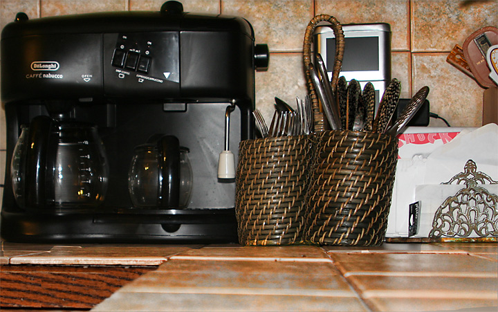
Someone once told me to try and shoot so that your photo is not title dependent. When I vote, I usually do not see the title so I kind of depend on the image to tell me a story. When I voted on your photo, I gave it a 5. I saw several different elements all competing for my attention so I did not know what your main subject was in the shot. You don't need so much of the counter in the foreground because it does not enhance the image. Personally, what I think would have been cool would be to remove everything but the coffee maker. Pull it away from the wall a bit and have the photo be that and the tile. The black against the beautiful colors in that tile would have made for a great contrast.
Check out the Strobist blog, in particular this video intro, which does a wonderful job of showing how still-lifes (lives?) benefit from getting that flash off-camera.
A little more subtle lighting would have been a huge plus in this image as it appears to be over done in some areas and under exposed in others allowing for light blooms that, while not overdone, distract. From an artistic standpoint, it needs something to create a little more interest - perhaps a little closer look at the coffee machine or the impliments baskets would have been a better choice - in partucular against the tiled background. A little more staging of the shot would have resulted in a better image.







 Add photograph to your favorites
 Add photographer to your favorites

 Photographer found comment helpful.


