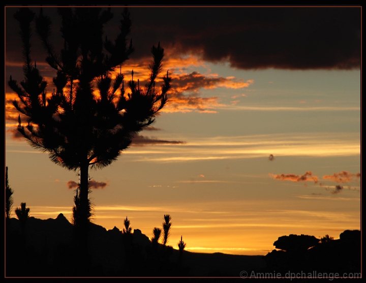
I like the effect you have achieved here. however, with some extra Post Processing, you could have made this sunrise really stand out. The colours are quite light and subtle in this image. By adding some additional contrast, both globally, and then to selected colours (yellow/red) you can make the sky glow much more, with richer tones. Added to this, adjusting the midtone levels slightly darker then will darken that area of the image, which is the sky area in this photo, helping richen the colours. These small changes then add significantly to the photo. These clouds are then closer to red, and lighter ones orange, ad the blue is darker..........
It is a shame the large bank of clouds is in the upper part of the shot, but nothing you can do about that. in terms of composition, the tree could have been better sitting on a line of third, therefore with more space included on the left hand side of the picture, making it stand more clearly as the subject
There is an interesting effect here that the author may have missed. If one takes the right side of the image out of the presentation, you get the effect of a Burning Bush. While the right side of the image gives a sense of depth and dimension, it is too vague to be truly effective. Additionaly, there is a little anomaly on the left (one quarter of the way in half way up the image) that looks very similar to a bad spot in a film emulsion - it's a natural object, but it is distracting. Overall a good entry into the challenge.






 Add photograph to your favorites
 Add photographer to your favorites

 Photographer found comment helpful.


