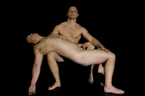
You did a great job of evoking the feeling of Michelangelo's Pieta with two men. Sorry but DPC is not going to appreciate that sort of feat. Hilarious to hear people criticizing the pose. That gives you an idea of the usefulness of aesthetic comments here.
The lighting has been mentioned before, as has the subject. For a nude to do well here it has to be flawless, as there are a number of users that vote low to anything nude. You've also lost the perv vote by using men.
For me, I think kudos to you for the attempt - try it again with the suggestions Jutilda and JulietNN made. Although you didn't use a direct flash (from reading your notes) - the lighting does need work. Try to soften out some of those harsh shadows.
Feel honoured that a couple of people likened it to the work of Michelangelo!
With models willing to pose like that, you have the potential to produce some great art.
Even as shot, there is no way this belongs at this end of the results.
Not sure of the eww or the shouldnt even be on here.
You got some good comments on the lighting, Jutilda said it the best.
In a nude like this, you need to go for a long lean pose, so stretching the legs out. His hand cupping looks awkward. The arm that is down, could be longer and leaner too. They eyes closed in teh reclining guy would go a long way too. Poses like this, need to feel artistic and are often more painful for the models, as they are not natural feeling.
You will always take the risk of getting bad and nasty comments when trying to think out side the box, specially if the subjects were not naked women. Wouldve been ok if they were women instead? Probably for some closed minded people, some they should be the ones not allowed here, for others you just have to be sorry for them, after all who wants to be glad2beana-hole anyways? Take the hateless comments good or bad and learn from them like the one from Jutilda , pefectly said. Nice job nevertheless and keep your art coming.
This has potential for being quite artful but doesn't quite make the mark. I think a single light source from one side perhaps. Or maybe even backlighting. I think the crop is a bit tight. I would have them less centered with more negative space to one side.






 Add photograph to your favorites
 Add photographer to your favorites


