3 lightsourcess:
1 - from above the normal light in my room.
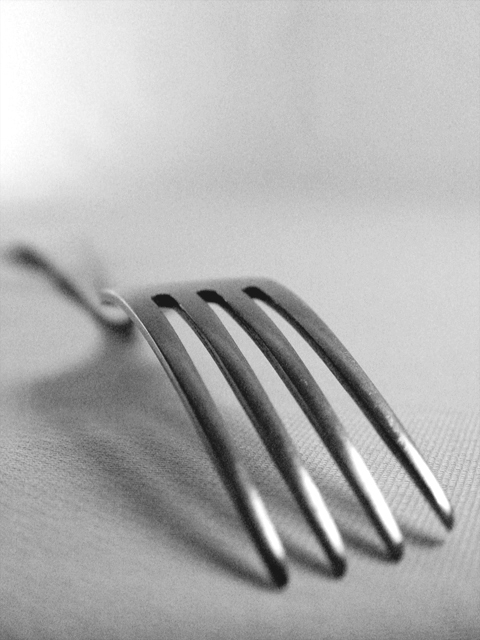
2 - 1 150W halogene light bounced with the white background.
3 - a normal 200 w light bulb in front of the fork.
improoved curves, levels, brightness & contrast, channel mixer to make it b/w.
Statistics
Place: 127 out of 221 Avg (all users): 4.8439 Avg (commenters): 5.3333 Avg (participants): 4.7629 Avg (non-participants): 4.8895 Views since voting: 1295 Votes: 269 Comments: 14 Favorites: 1 (view)
can't decide if this has the best or worst title ever. still, i'm not judging the title, it's the photo that's important. actually, no, scrub that, the title is brilliant because it LOOKS like your picture. the use of multiple sources of light isn't really that obvious here, unfortunately. but i like your use of focus. it could also do with a bit of grain reduction (neatimage which is freeware is good). 6.
Like the composition, though I'm not such a fan of the grain of the shot. I also think that missing the brightest area of the tines with you chosen dof might be a mistake - it leaves a conflict between the natural draw of the brightness and the opposing draw o the focus that doesn't allow the eye to settle at all. But there's a feel I like here very much.
Very minimalistic. I really can't tell if this fork is lit by more than one light source; the challenge was to use obvious light sources. It also seems slightly out of focus and grainy - perhaps you were trying for this effect.
nice way to make the "uninteresting" interesting. the b/w works well with the shot. i think maybe the focus could be a little sharper in this case. might be better with some of the top cropped off, seems to be a lot of negative space, it might make the subject pop out even stronger.





 Add photograph to your favorites
 Add photographer to your favorites


 Photographer found comment helpful.


