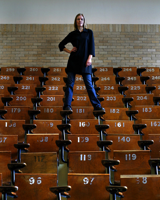
Great use of repeating patterns and lines. The model breaks up the image nicely. Her leg seems to blend into the desk a bit. I'd have used lighter pants to stand out against the dark wood maybe? Desk 117 is also a bit of an off element due to the darker wood. Maybe move over a row or two? 8
'kay, i give up. what's the realization? is there a significance behind the number 181? or are you purposely trying to mess with my head? either way, you've madea seemingly simple image interesting from the title, for i have looked and though about the shot / title relationship for an unhealthy amount of time. also, the setting looks very familiar to me - was it you who once submitted a B&W shot of the same room? lighting appears a little bit harsh and details of your subjects face are a bit unclear (though i like how she strikes a pose, if you'll pardon a well-worn madonna-esque expression). it's a pity the exposed brickwork didn't go to the ceiling, as the white wall is distracting (probably messed with your white balance too). this could have been avoided if she came down a couple of levels (though would 139 be so significant?). as for meeting the challenge, i think it does, in a way. it's a bit unusual, i think. 5.
I like the overall scene but I don't really like the posed subject. If she were in another position where she wasn't looking at the camera I think it would be more poweful.
The title made me think. I love the perspective on this. I know there's nothing you can do, but if the wall were not bricked, and simply white, I believe the message would have been even stronger. Great job!







 Add photograph to your favorites
 Add photographer to your favorites


 Photographer found comment helpful.

