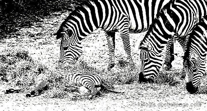
Taken at the Richmond Metro Zoo last Saturday. I am probably taking the processing too far on this one, but I'll live and learn I guess. :-) I rather like the high contrast given the subject matter --- and the surrounding dirt/grass was distracting to me when the image was in color and/or shades of gray. Fingers crossed that others like it too.
Statistics
Place: 386 out of 435 Avg (all users): 4.8239 Avg (commenters): 5.7778 Avg (participants): 4.8113 Avg (non-participants): 4.8611 Views since voting: 793 Views during voting: 237 Votes: 142 Comments: 10 Favorites: 0
I think this picture is over photoshopped. The value of the zebra's pattern was taken away by forcing the rest of the image to mimic the animals coloring.
Most original zebra image I've seen in a long time and unusual processing fits well. Far from the usual characteristics of typical DPC ribbon winners, but one of my top ten for this challenge, despite my thinking that about 1/3 of the area between the lower edge and the closest foot could have been cropped away to good effect.
Very different and unique conversion. A good solid image that is crisp, sharp and properly framed and composed - a technical success in every way. From an artistic standpoint, it is an intersting image but of less than universal appeal. A good entry into the challenge.






 Add photograph to your favorites
 Add photographer to your favorites


 Photographer found comment helpful.


