Lovely lighting and beautiful scene. Your work is always so polished.
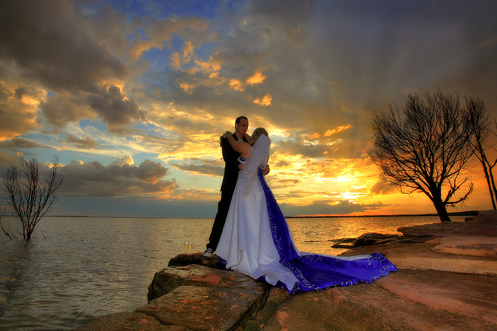
I just wonder in this case whether the centered placement of the couple and the fact that the woman's face is turned away cost you a bit of on the score. The far left side of the image does not seem to provide as much of the 'good stuff' that the couple and the right provide. But then again...what do I know...you're the pro!
I would have preferred a closer look. If this is a sunset photo, they're in the way. If this is a wedding photo, they're to small, at least in this resolution.
I like the idea and the composition of this shot, however, the subjects are too dark. They needed some light reflected onto them to make them stand out more, as attention is currently drawn by the background sunset as the couple are quite dark compared to the rest of the scene. A slight change int he angle they are at may also have helped, allowing us to see part of her face.
A good solid image that is crisp, sharp and properly framed and composed it appears to be ever so slightly over sharpened - the edge detail on the subjects gives the image a composite look which is not a positive. From an artistic standpoint, it is an intersting image but the slight over done white bloom in the sunset is a negative. A little softer focus on the subjects would have been a plus in addition to a little better light control. Fill flash would have been a good choice. A good entry into the challenge.







 Add photograph to your favorites
 Add photographer to your favorites

 Photographer found comment helpful.


