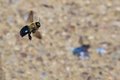
I do have shots of Sir Thomas.... But I felt compelled to enter a pigeon. Haven't entered a pigeon in awhile, I don't think. And I shot lots and lots of pigeons. Got shat upon as well, which is probably the real reason I'm entering the challenge - have to make that event worthwhile. :-)
Crop, Topaz'd, dup layer with multiply blending mode reduced in opacity are the primary editing steps.
[Apr. 28th, 2009 05:04:47 PM]
AND.... apparently it sucks. Apologies to the voters again. I seem to be doing that alot this year, huh?
[Apr. 30th, 2009 02:09:47 PM]
And yes, it is an awkward composition.
Here's another one I considered. May have fared slightly better.
Statistics
Place: 94 out of 143 Avg (all users): 5.3200 Avg (commenters): 6.3333 Avg (participants): 5.1212 Avg (non-participants): 5.4404 Views since voting: 1116 Views during voting: 336 Votes: 175 Comments: 12 Favorites: 0
:) Every photo that looked like it had pigeons in it, I thought might be yours. No one puts soul in pigeon photography like you do. I very much liked this one in the challenge. I liked it that your perspective was looking down on this guy flying so close to the water. I try to get those shots at the park all the time, but am rarely able to pull them off to where you get such clear detail in the wings and features!
I have this photo a 7. People don't really appreciate how hard it is to get good blur where the wing is perpendicular to the water so perfectly as shown in this photo. When the bird is flying directly into the light, then the blur become much more dramatic when shot from the bird's side. The lighting works a little bit against you in this shot because his face is in shadow. The wing and the water are beautiful and well photographed!
I always enjoy photos like this and am disappointed in the voters to see it down here. Bah!
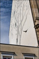
A curious theme in this challenge are images being too tall. This image would have presented a much more positive impression if it had been shorter concentrating the viewer on the bird and not the background. With a little shorter image, the viewers eye would be attracted to the bird rather than the background increasing the soft focus effect from a negative to a positive. It's almost abstract in concept and that to this reviewer is a plus. While size is a minor issue, sometimes it can have great impact on an image and this is one of those instances. A good solid entry into the challenge originally rated a 6 and rerated to a 7.
I'm always late to the dang party! Great choice Deb. The light bouncing up under the wing, adding a subtle glow, is what tips the scales for me. Beautiful and most definitely poetic.






 Add photograph to your favorites
 Add photographer to your favorites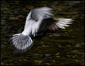


 Photographer found comment helpful.


