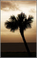
I am with the commentors here, Cropping out the tree on this has made it look unfinished.....
Including that space would have then moved the tree closer to the correct line of third which is a strong place to have the subject, and therefore added to your composition here.
Again, an addition of a little saturation in Post processing would help this a little.
Not sure about the border. Wouldn't have included it. I don't think it needs framing like that.
But......Did you consider this in Black and White. Desat the entire image.......Fits with the Old Oak tree and looks quite effective as well.
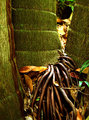
I like the subject and the detail in it, but the composition seems a little odd to me. Kind of like it is all squished into the bottom left quarter of the frame.
Coming back to comment - Nice colors and focus. The building adds some interest and gives a sense of age to the tree. I wish that you had included all of the tree though.
I love the colors, the composition and i like the border too. I just think the tree is kind of dark and it's left part looks cutted. A little more to the left would be great in my opinion. I hope i wasn't rude. Good luck to you! Nice shot.






 Add photograph to your favorites
 Add photographer to your favorites


 Photographer found comment helpful.


