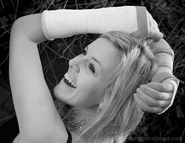
Initial impression: Love the composition here, reflects a vibrant, cheery, energetic nature barely contained by her injuries. I bet she'll be back snowboarding (or whatever other adrenaline sport she enjoys when there isn't any snow) as soon as those bandages come off! She's probably the sort who has the nurses in stitches when they're trying to treat her.
Technical: Compostion pleasing, the pov is different (and thus good), like the crop and the contrast, the dof is good, the lighting is better on the face and eye catchlights are good, but almost gives a flat aspect to her arm.
Artistic: Though the b/w doesn't necessarily harm this shot, I wonder if it does the original any justice. Have to agree with comments pointing out the waxiness of the skin, though I see it more on her arms than her face, and lack of lips, especially as she looks to have a lovely smile.
FWIW: I probably would have gone with colour, and had Riss bring along a couple of lipsticks to experiment with and help frame her mouth.
I connected with the shot because of personal experience. So for me, the concept of 'happy, pretty young girl with ugly injury/disability = not quite right' came through loud and clear, and I voted highly.
One thing that did occur to me however, was the method of b&w conversion. Her complexion looks too waxy and lip definition is almost non-existent (which is an important consideration because her smile plays a big role here). Using the red filter (and max white) when converting to b&w will typically cause this to happen.
The low score could just be a simple matter of folk not liking the edit. These days, with people complaining about comments and angry pm's, not many will risk telling you they don't like your artistic choices...
I didn't vote in the challenge, but since you asked for comments... I think she is lovely and your concept was a clever reponse to the theme. I'm not crazy about her "extreme diagonal" position in the frame, but that's just me. :-) Concept-wise, I wonder if you'd make a stronger statement with more glamour to contrast with the casts. The idea is there but it doesn't jump out at you; perhaps it would with a bit more emphasis on dress and jewelry (or perhaps the garden setting isn't glam enough?). Anyhow, despite these criticisms I like the photo.






 Add photograph to your favorites
 Add photographer to your favorites

 Photographer found comment helpful.


