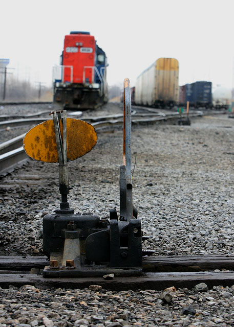
From a technical standpoint, this is a terrific effort - crisp, sharp with everything detail well controlled and captured. From an artistic standpoint, it's rather bland and uninviting to the viewer. Sometimes an image, even one as technically competant as this one is, is just an image. A worthy entry into the challenge and directly related to the challenge subject. A good effort falling short in the artistic sense.
It's creepy how similar our tracks are. Except my flag was green and read, what does yellow mean? I like the way the flag contraption is in between the red train and the yellow train, great composition, like it's preventing them from coming into contact (which is it's job after all).
Lighting wasn't very good. Perhaps this picture would have been better if it was taken at sunset or sunrise. Also, focusing more on the foreground thna the background to place additional emphasis on the subject. This could have created a background with nice cascade of color.





 Add photograph to your favorites
 Add photographer to your favorites


 Photographer found comment helpful.


