Wonder how many comments will tell me it's blurry? :-)
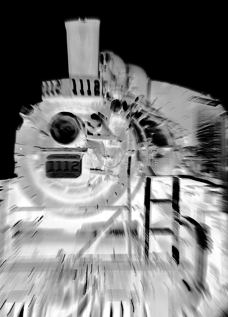
I've shot this train before for the original T&R challenge. However, this time I had much less time and no immediate access to the train, a new, fugly fence was in the way and the light sucked. Still, did the best I could and tried to make up for my lack of usual extreme POV by zooming in/out as I shot to add some motion and interest.
pp: RAW conversion, curves, brightness/contrast, rinse and repeat, saturation, desat, invert, resize, usm 2x, save for web
Statistics
Place: 164 out of 168 Avg (all users): 4.1905 Avg (commenters): 5.3000 Avg (participants): 4.1471 Avg (non-participants): 4.2113 Views since voting: 1064 Views during voting: 318 Votes: 210 Comments: 19 Favorites: 0
Now that I know this was yours, I feel bad about giving you a 4. I guess there is a good reason that voting is anonymous. At least I left you feedback to tell you why!
My first impression of the image is that it has immediate impact - the zoom burst actively sucks the viewer into the picture, into the front of the oncoming train. The processing is extreme, but actually really quite appeals to me - I think it adds to the in your face impact of the shot (it somehow seems appropriate that the viewer is forced to fight the onslaught of the incoming train, I think it creates an interesting kind of emotional engagement with the shot). The nightmarish quality is rather appropriate given the perspective in this case.
Overall, I'd say it's an unusual, artistic perspective on the subject matter, and in my opinion an interesting one that has been very effectively executed. As for the score... It's not everyone's cup of tea, ah well.
I applaud you for sticking to what you like despite knowing the criteria for scoring high on DPC. I too used this site primarily for learning in my early days, experimenting alot more and waiting for comments so I can improve. I personally think this is very artistic and nice.
Same train as me, but I shot from inside the fence. Even though they aren't open, the guy working was more than accommodating to let me in to shoot what ever I wanted.
Overdone effects ruin an otherwise good idea. A better approach would have been to reduce the SFx concept and just create an image. There is a good idea here - it's just inartfully executed and frankly fails to impress in either a technical or artistic sense. More thought into how this image presents would have been a plus.
Don't know if this will do well, but I like this. The title is necessary or else it just looks out of focus. With it, the image is jarring and alarming - good job.
I think you're probably getting creamed right now for trying something different. I think it has a really cool ghostly feel to it and yet we can still tell what it is. It has more zing to it than half the photos I've seen so far.





 Add photograph to your favorites
 Add photographer to your favorites

 Photographer found comment helpful.


