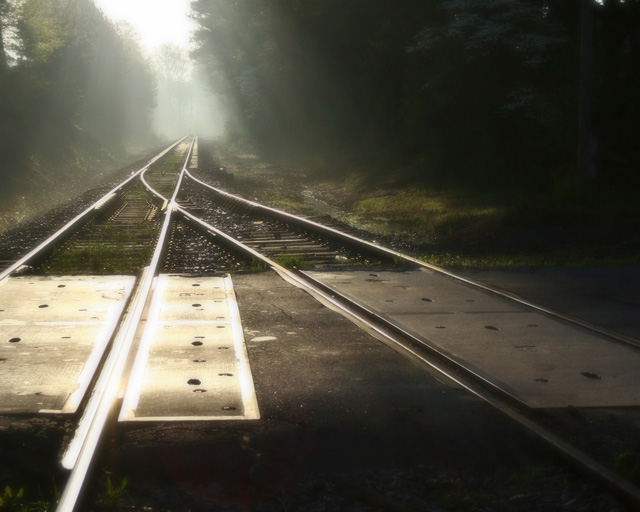
A great idea which is very difficult to pull off without some heavy post processing. The rail highlights are overdone which is a negative and maybe a by product of trying to capture or make the rays of light more distinct. While this image is technically flawed, it is a complete artistic success because it offers an ethereal feeling of time, space and dimension - it could very well be a noir book cover if done in black and white - which, come to think of it, might be something the author might want to consider just as an exercise to see if the image is improved. Sepia treatment might also be a good suggestion. The author should do themselves a favor and tinker with this using a post processor to see what happens - this image has a lot of potential if handled properly - a good print competition winner.
The glare on the tracks is a little distracting. I think that croping the bottom half or even moving up the rail pass where the two lines meet might have been better. JMO! Overall it's a nice shot.






 Add photograph to your favorites
 Add photographer to your favorites

 Photographer found comment helpful.


